INNER FIRE FITNESS BRAND IDENTITY AND WEBSITE
When I was asked to develop the visual identity for a hot new fitness studio, I knew I wanted to help them communicate the compelling incongruity of a studio that delivers the exhilarating experience of group fitness and the calming environment of an upscale spa.

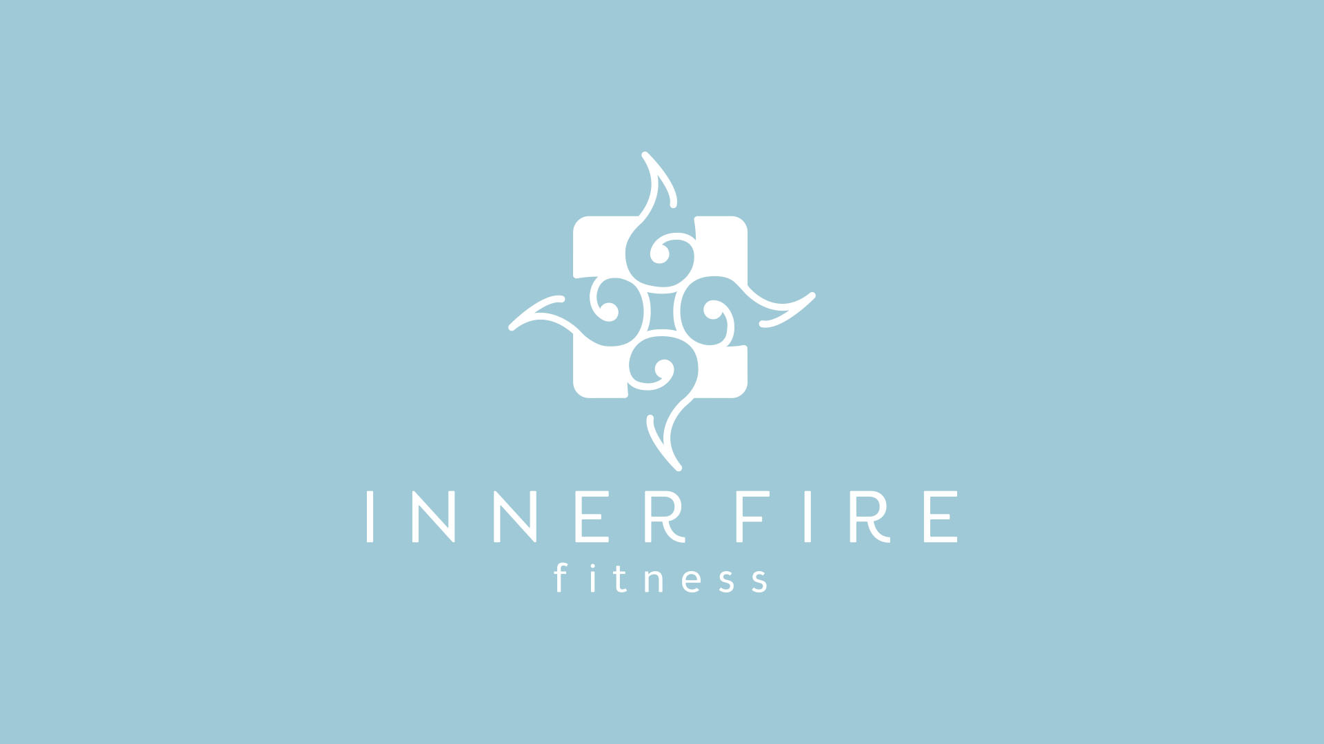
THE FROZEN FLAME
The Inner Fire brandmark combines dynamic, energizing forms with a cool, soothing color palette to disrupt the viewers' preconceived notion of what fire can and should look like.
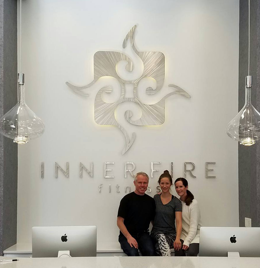
TRANSLUCENT + METALLIC
By combining a backlit, translucent backdrop with a brushed metal structural form, we created a dramatic, larger-than-life brand presence in the main entry.

completing the tone
Customizable LED lighting allows the space to be visually transformed to fit the mood of any class, or hosted event.


RESPONSIVE WEBSITE LAYOUTS
Clean, elegant, & easy to navigate, this site design puts the focus on the ways guests can experience Inner Fire Fitness, while also showing the internal desire, drive, passion, and results that are unlocked by engaging with IFF. Photography focuses on the internal rather than external journey of the model
MORE WORK