JOOT – NAMING, LOGO DESIGN, & BRAND IDENTITY DEVELOPMENT
NAMING AND LOGO DESIGN FOR A SaaS STARTUP
I love working with startups. Helping new companies bring their innovative ideas to life via logo design, brand identity development, and articulation of their brand promise is exciting for me and energizing for the people that I work with. Joot is a software platform that eases the compliance load for CCOs at small- to mid-sized investment advisory firms. They exist to help their clients feel at ease and we wanted that to come through in all of the design elements in their brand identity toolkit.
We wanted the company’s new name to connote cooperation, simplicity, and ease of use. It needed to stand out from the competition while feeling fun, supportive, and approachable. We quickly focused on the word “Adjutant” which is a military officer who acts as an administrative assistant to a senior officer, and shortened it to the more playful and distinctive Joot.
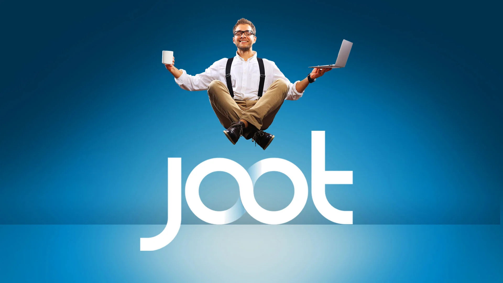
In the logo design process, we built the wordmark around two connected letter “O” forms that intertwine to create an infinity symbol. This represents the unlimited support and partnership that customers receive from Joot.
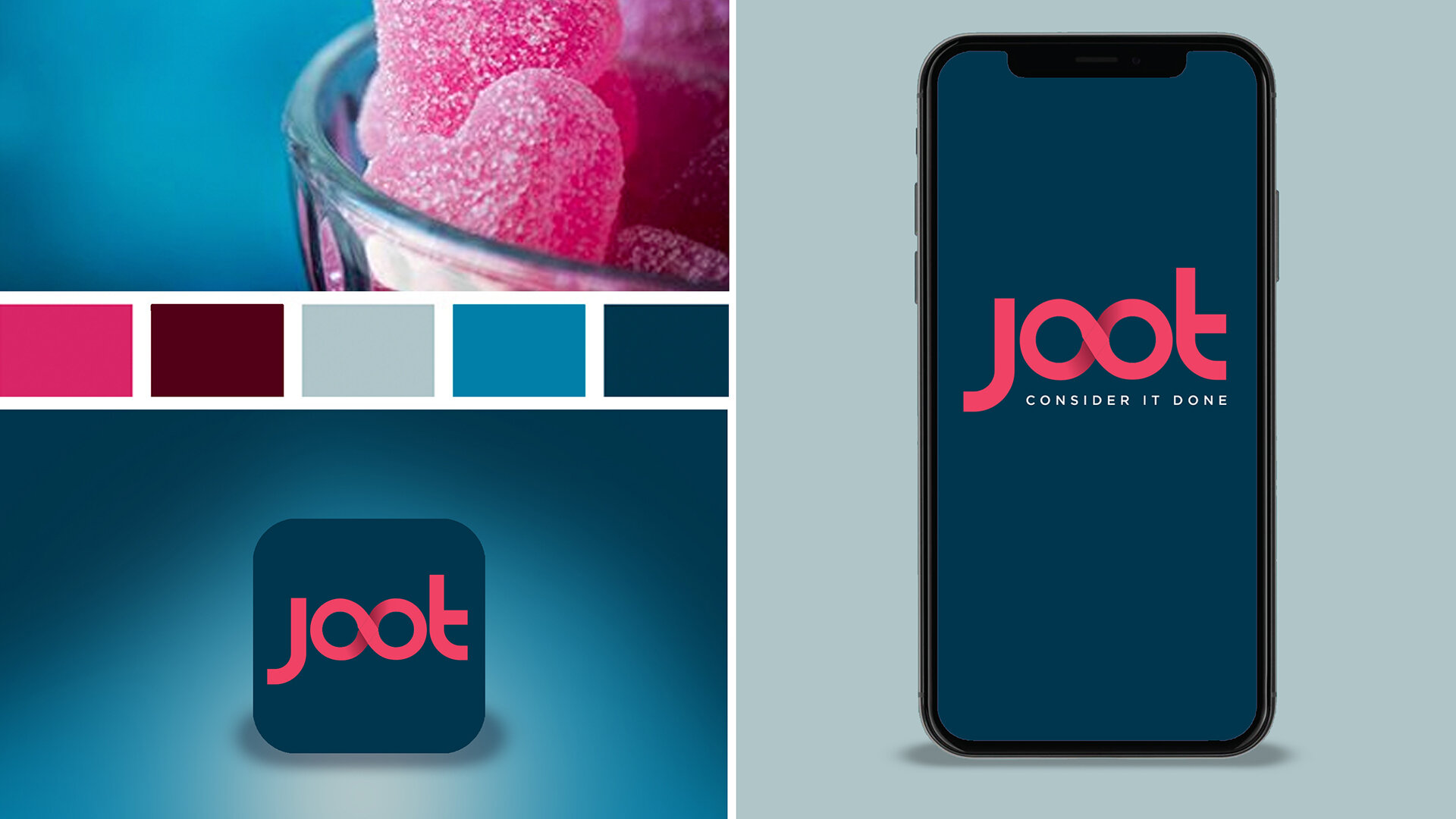
Our color palette and visual style leverages a deep blue and burgundy foundation to create feelings of calm, serenity, and stability. This is punctuated by an energizing raspberry that draws attention and communicates an exciting new entry to the marketplace.
MORE WORK